The reason most “viral iPhone photo edit settings formula” articles disappoint you is that they sell one formula as if light didn’t change between a sunlit beach and a dim restaurant. The actual photographers and editors who get clean results from the Apple Photos app run different formulas for different scenarios, and they treat the numbers as starting points, not absolutes.
This guide collects six real iPhone photo edit settings formulas — five from a published TikTok-formula compilation on retouchingzone.com, plus one shared by a Reddit user in r/ApplePhotos who edited a golden-hour beach photo entirely in the Apple Photos app. For each formula you get the exact slider values, the lighting scenario it’s designed for, and the tradeoff that breaks it when your photo doesn’t match that scenario.
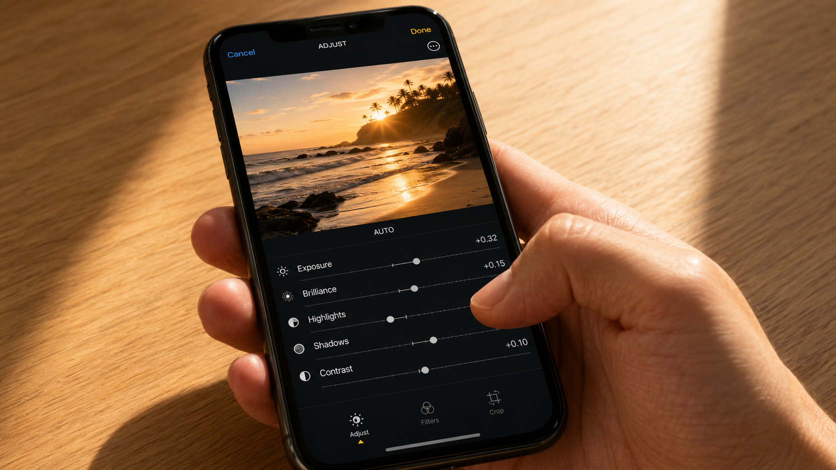
The numbers below are starting points for the Apple Photos adjust panel (Edit → Adjust). Apple’s sliders, documented in Apple’s iPhone photo editing guide, run from -100 to +100 on most parameters. If a slider value below seems extreme, that’s because some formulas exploit how Apple Photos stacks adjustments — explained below.
Why the Universal iPhone Photo Edit Settings Formula Fails on Most Photos
Search TikTok for “iPhone photo edit formula” and you’ll find a 30-second video with someone applying a single set of numbers to every photo they ever shoot. The comments are full of people saying it worked. The comments are also full of people saying the same formula made their photos look washed out, plastic-skinned, or muddy.
Both groups are right. The viral formula works on photos that match the lighting condition the original creator was filming in. Push the same numbers onto a high-contrast backlit shot, a low-light indoor scene, or a flat overcast landscape and the formula breaks.
Generic editing tutorials like the one on shotkit.com recognize this and avoid giving any numbers at all — they suggest qualitative adjustments like “small,” “gentle,” or “modest.” That’s safer but useless when you want a starting point. The compromise this guide takes: give you the specific numbers, then tell you exactly what will go wrong if you use the wrong formula for the wrong photo.
The “Viral TikTok” Formula (Plus a Strange Instruction)
Of the formulas circulating across TikTok and Reddit, the one most frequently cited — compiled and republished by retouchingzone.com — looks like this:
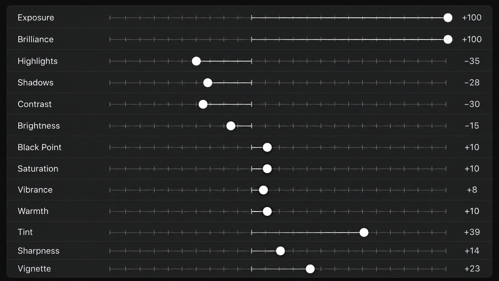
| Parameter | Value |
|---|---|
| Exposure | +100 |
| Brilliance | +100 |
| Highlights | -35 |
| Shadows | -28 |
| Contrast | -30 |
| Brightness | -15 |
| Black Point | +10 |
| Saturation | +10 |
| Vibrance | +8 |
| Warmth | +10 |
| Tint | +39 |
| Sharpness | +14 |
| Vignette | +23 |
The strange part is the instruction that follows: “First, apply all values below at full strength. Then, drag the Exposure and Brilliance sliders to the very beginning and lower them to 0.”
This isn’t a typo. The trick exploits a behavior in the Apple Photos app — pushing Exposure and Brilliance to +100 first, then pulling them back to 0, changes how the subsequent adjustments stack on the underlying image data compared to never touching them at all. Whether the visual difference is significant is debated; some users find it produces a more dramatic mid-tone shift than the direct equivalent. Either way, that’s the published formula.
When this formula breaks: The +100 Exposure / +100 Brilliance reset move blows out bright photos that are already exposed correctly, especially anything shot near a window or outdoors in midday sun. The Vignette +23 darkens corners — fine for portraits, harmful for landscapes or wide group shots.
Five Scenario-Specific Formulas with Real Numbers
If you accept that no single formula works for all photos, the alternative is matching the formula to the scenario. Below are five published starting points from the same retouchingzone.com compilation, each tuned to a specific lighting condition.
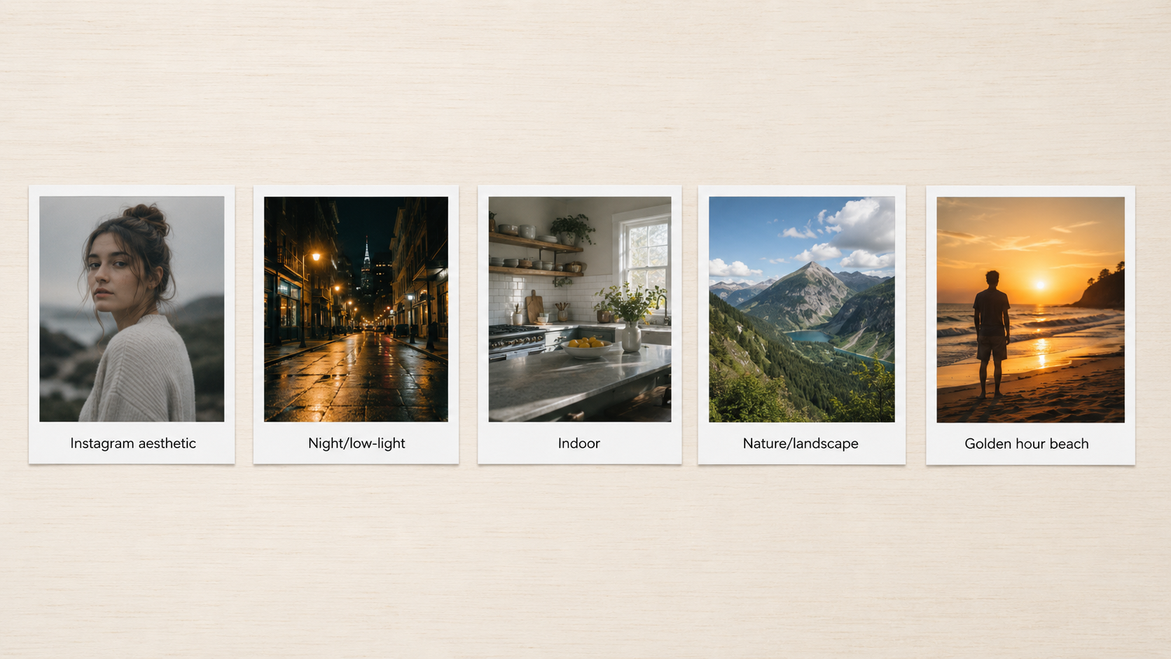
Instagram Aesthetic (slightly cool, low contrast)
Used for the “muted film” Instagram look that’s been dominant since around 2020.
- Exposure: +10 to +15
- Brilliance: +20
- Highlights: -25
- Shadows: +15
- Contrast: -15
- Brightness: +10
- Black Point: +5
- Saturation: -10
- Vibrance: +15
- Warmth: +12
- Tint: +5
- Sharpness: +15
- Definition: +10
What it does: The Saturation -10 + Vibrance +15 combo is the key move — Vibrance protects skin tones while pulling everything else more colorful, then Saturation pulls the whole image back slightly, leaving a film-like color balance. Warmth +12 adds gold.
When it breaks: On photos with strong neutral grays (architecture, overcast skies), the Vibrance push will tint the grays slightly warm and look off. On photos with reds (autumn leaves, brick walls), the Saturation cut will desaturate the reds and make them dull.
Night and Low-Light Photos
Designed for photos shot after dusk, indoor low-light scenes, and concert/club photography. Many of these numbers are aggressive because phone sensors handle low light poorly.
- Exposure: -10
- Brilliance: +30
- Highlights: -45 to -60
- Shadows: +25
- Contrast: +15
- Brightness: -5
- Black Point: +15
- Saturation: +5
- Vibrance: +20
- Warmth: -10 to -15
- Tint: +10
- Sharpness: +20
- Noise Reduction: +15
What it does: The aggressive Highlights -45 to -60 pulls down blown-out light sources (street lamps, signage, restaurant pendants). Shadows +25 lifts deep blacks so detail is recoverable. Warmth -10 to -15 counters the orange tungsten cast common in indoor night shots.
When it breaks: If the original photo is actually a properly-exposed long exposure (iPhone in Night Mode tripod-stabilized), Highlights -60 will crush real highlights you wanted preserved. Noise Reduction +15 makes faces look plastic at portrait distances.
Indoor Photos (Mixed Daylight + Artificial Light)
For shots taken inside during daylight hours — kitchens, living rooms, cafes with window light. The hardest lighting condition because of mixed color temperatures.
- Exposure: +15 to +20
- Brilliance: +35
- Highlights: -20
- Shadows: +25
- Contrast: -10
- Brightness: +10
- Black Point: +8
- Saturation: -5
- Vibrance: +12
- Warmth: -8 to -12
- Tint: +5
- Definition: +12
What it does: Warmth -8 to -12 is the critical move — counters the orange cast from incandescent or warm-LED indoor lighting. Brilliance +35 lifts mid-tones without crushing highlights.
When it breaks: If the indoor lighting is actually cool (newer LED kitchens, office fluorescents), the -8 to -12 Warmth push will make skin look sickly blue. In that case, swap to Warmth +5 to +8 instead.
Nature and Landscape
For outdoor wide shots, hiking photos, mountain vistas, forest interiors. Often needs the most restraint to avoid over-processing into HDR cartoon territory.
- Exposure: -5
- Brilliance: +15
- Highlights: -30
- Shadows: +10
- Contrast: +12
- Brightness: -5
- Black Point: +10
- Saturation: -8
- Vibrance: +25
- Warmth: +8
- Tint: -5
- Sharpness: +10
- Definition: +20
What it does: The Vibrance +25 with Saturation -8 is the classic landscape move — boosts greens and blues (sky, foliage) heavily, while not overcooking them into neon. Definition +20 sharpens architectural lines (mountain ridges, tree silhouettes) without adding noise like Sharpness would.
When it breaks: On hazy or foggy landscape photos, the Vibrance +25 will fight the natural atmospheric mood and make the image look digitally cleaned. Reduce to Vibrance +10 max for atmospheric shots. On autumn foliage, Saturation -8 cuts the reds you wanted — flip it to Saturation +5 instead.
Golden Hour Beach / Sunset (Reddit r/ApplePhotos User)
A Reddit user in r/ApplePhotos (Opening-Sea-8560) shared this formula for a flat, slightly underexposed golden hour beach shot where the subject blended into the background:
- Exposure: +15
- Brilliance: +15
- Highlights: +40
- Shadows: -25
- Contrast: +35
- Black Point: +5
- Vibrance: +8
- Saturation: +15
- Warmth: +8
- Sharpness: +5
What it does: Notably, Highlights is pushed up to +40 — most formulas reduce highlights, but for golden hour the highlights are the subject (the warm sun-glow). Shadows -25 deepens the foreground sand and rocks to recover dimension. Contrast +35 separates the subject from the soft golden background.
When it breaks: This formula only works for soft, underexposed golden-hour shots. Apply Highlights +40 to a midday beach photo and the sky burns out completely. Apply it to a backlit shot already with strong highlights and you lose the entire sky.
The Apple Photos Slider Order That Matters
The numbers above only work if you apply them in the right order. Apple Photos applies adjustments in a roughly fixed sequence regardless of which slider you touch first, but the math doesn’t work that way for what you perceive as you edit. The working order that produces predictable results:
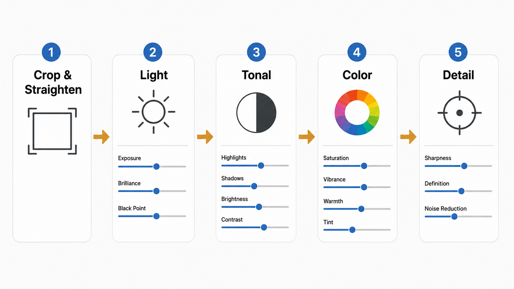
- Crop and straighten first. Done before any color or light adjustments. The slider values you choose later depend on the framing.
- Light group: Exposure → Brilliance → Black Point. Set overall image brightness. Get the histogram looking reasonable before touching anything else.
- Tonal range: Highlights, Shadows, Brightness, Contrast. Recover blown bright areas, lift deep shadows, then decide how much separation you want between light and dark.
- Color group: Saturation, Vibrance, Warmth, Tint. Always Vibrance before Saturation, because Vibrance protects skin tones. Warmth and Tint shift the whole image temperature.
- Detail group: Sharpness, Definition, Noise Reduction. Last because over-sharpening artifacts from earlier adjustments would compound.
- Vignette and filters last. Optional finishing touches.
If you flip steps 2 and 3, you’ll find yourself adjusting Highlights to compensate for Exposure choices that weren’t final yet. The result: more total slider movement, more risk of pushing values into ugly territory.
When Every Formula Above Breaks
Five photo conditions where you should ignore the copy-paste numbers entirely:
Already overexposed or already underexposed photos
Any photo where the camera missed exposure by more than +/- 1 stop. Formulas assume the original capture is reasonably balanced. If the photo is already blown out or already crushed, no amount of slider work will recover it cleanly.
High-contrast backlit scenes
Sunset behind a subject, window light behind a person indoors, stage lighting. These photos need targeted edits (mask the subject vs. mask the background separately) and Apple Photos lacks the masking tools to do this well. Move to Lightroom Mobile for backlit scenes.
Photos taken in HDR mode you didn’t notice
Modern iPhones default to HDR for most shots. If your photo was captured with HDR, it already has aggressive highlight recovery baked in. Stacking another -30 Highlights on top of an HDR capture produces flat, lifeless images. Check the photo info first.
Portraits with already-edited skin tones
If a photo has been through Portrait mode or any in-camera beautification (Smart HDR + Deep Fusion sharpening), the skin texture is already manipulated. Adding Sharpness +14 or Definition +20 on top creates the plastic-skin look people associate with bad iPhone editing.
Screenshots, screen captures, or photos-of-photos
None of the formulas work. Screenshots have no real photographic data to recover. Photos of paper or screens have moire patterns that Sharpness amplifies.
How to Adjust the Formula for Your Specific Photo
The honest truth from photographers who’ve used Apple Photos seriously: the formulas are starting points, not destinations. After applying any formula above, the photo will usually need 2-4 specific tweaks before it actually looks right.
A working method:
- Apply the formula closest to your photo’s scenario.
- Look at the result for 5 seconds. Identify which single area looks wrong (too dark, too saturated, faces look plastic, sky looks fake).
- Find the single slider most responsible. Reduce it by half, then re-evaluate.
- Repeat until nothing obvious is wrong. Usually 2-3 cycles.
- Compare to the original by tapping and holding the photo. If the original looks better in any specific way, dial back the relevant slider.
Photographers who edit iPhone shots seriously in the Apple Photos app rarely end on the exact starting formula. The closer the photo’s scenario matches the formula’s intended scenario, the less adjustment needed — but assume 10-30% slider drift from any starting point.
Frequently Asked Questions
Should I copy these formulas exactly or adjust per photo?
Copy as a starting point, then adjust at least 2-3 sliders per photo. Even the user who shared the golden hour beach formula on r/ApplePhotos noted that it was tuned for that specific underexposed shot — they explicitly said different lighting conditions would need different values.
Why does the same formula look great on one photo and bad on another?
Because the starting photo’s exposure, contrast, white balance, and ISO are different. Formulas assume a baseline; if your photo’s baseline is +1 stop brighter than the original creator’s, every slider in the formula now over-corrects in that direction.
Is Lightroom Mobile better than Apple Photos for editing iPhone shots?
For 80% of casual edits, Apple Photos is enough and faster. Lightroom Mobile becomes necessary when you need (a) masking (select sky vs. subject), (b) HSL color sliders (orange skin tones independent of red foliage), or (c) presets you’ve built across photos. Reddit users in r/Lightroom commonly recommend starting in Apple Photos and only moving to Lightroom if Apple Photos can’t get you there.
Does the TikTok “+100 Exposure then drag to 0” trick actually do anything?
Debated. The underlying math: Apple Photos stacks adjustments rather than processing them in isolation, so a slider that was pushed to +100 and returned to 0 may behave differently from one never touched, depending on iOS version and which other sliders are active. The visual effect is usually subtle. If you can’t see a difference, you haven’t lost anything by skipping the trick.
Why do my edited photos look worse than the photo I copied the formula from?
Two reasons: the source photo had different lighting than yours (the bigger factor), or the source creator did 3-4 manual tweaks on top of the formula that they didn’t mention. Most “I used this exact formula” social posts skip the post-formula adjustments.
What’s the single most important slider to learn first?
Highlights and Shadows together. These two control the most visible quality difference between an unedited and edited iPhone photo. Get comfortable with the -30 to +30 range on each before worrying about anything else.
Bottom Line
The viral “iPhone photo edit settings formula” trend on TikTok promises a single magic set of numbers. The honest reality from the published formulas above is that there are at least six different formulas for six different lighting scenarios, and even those need 2-4 manual tweaks per photo to land cleanly.
Use the formulas above as starting points matched to your photo’s lighting. Apply in the order — Light → Tonal → Color → Detail → Finish — that Apple Photos rewards. Stop expecting a single formula to handle every photo, and you’ll get better results in about a third the editing time.
For more decision frameworks on iPhone photography gear and editing workflows, see the rest of the Photo Editing and Mobile Photography categories.